
-
Axis Guide
Regular price €66,00Regular price -
Echo Design
Regular price €296,00Regular price -
Flow Layout
Regular price €190,00Regular price -
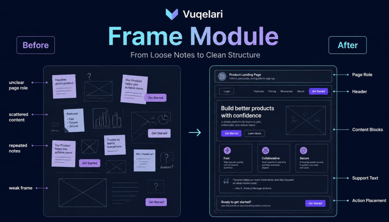
Frame Module
Regular price €172,00Regular price -
Grid Design
Regular price €482,00Regular price -
Halo Collection
Regular price €200,00Regular price -
Luma Design
Regular price €245,00Regular price -
Pulse Bundle
Regular price €117,00Regular price -
Vertex Map
Regular price €215,00Regular price


Built From Curiosity About Better Interfaces
The People Behind the Learning Pages
-

Molly O'Connell
Visual Interface Designer
Molly works with hierarchy, spacing, typography rhythm, and visual order. She shapes screens so sections feel calm and balanced. Her work
supports clean examples for
UI study. -

Clayton Booth
Interface Designer
Clayton studies page sections, card layouts, and screen balance. He prepares visual drafts with calm structure and careful spacing. His work supports readable screens across Vuqelari course materials. -

Jayson Singleton
UX Researcher
Jayson reviews learner needs, task notes, and study behavior patterns. He organizes findings into simple observations for course planning. His work helps shape examples around practical interface questions.


Design Thinking, Shaped Into Study Materials
Small Details That Make Study Feel Organized
-

Step-by-step
Each module organizes UI/UX topics into focused sections for steady self-paced study.
-

Practical Tasks
Each task connects interface ideas with small exercises for thoughtful design practice.
-

Visual Examples
Each example shows layouts, flows, and sections through simple visual study references.
-

Calm Format
Each section supports quiet reading, review notes, and gradual design topic exploration.


30-days refund guarantee

Start With a Sample From Vuqelari
Notes From the Study Journey
-

Henrietta Hyde
Henrietta was interested in UI/UX design but often judged screens only by how they looked at first glance. She wanted to study the reasoning behind page order, section balance, support text, and action placement. The course format was useful because it combined written explanations, small examples, and practice tasks without making the material feel overloaded.
“I liked how each section showed what to look for before thinking about final visual details.” -

Preston Moore
Preston came to Vuqelari after reading many UI/UX terms but finding it difficult to connect them into one study path. He wanted to understand how screens are built, how sections work together, and why user flow matters before moving into wider design topics. The structured modules were useful because they arranged screen anatomy, layout blocks, and review questions in a calm learning order.
“Vuqelari helped me stop looking at screens as random parts and start reading them as organized layouts.”


Look Inside the Course Materials
Discover On All Devices


